1. 父亲儿子的上下margin合并
1 | <head> |
这样儿子的margin-top会给到父亲,把父亲挤下来,但只要在父亲里加:
border: 0.1px solid green;padding: 0.1pxdisplay: table;display: flex;(不加width的话会把width变成0)display: inline-block(不加width的话会把width变成0)
则上下margin不会合并,父亲还是会把儿子包起来
2. 对齐中文
1 | <head> |
3. 文字溢出变省略
显示一行
1
2
3
4
5
6
7
8
9
10
11
12
13<style>
div{
border: 1px solid red;
white-space: nowrap;
overflow: hidden;
text-overflow: ellipsis;
}
</style>
<body>
<div>
只显示一行,超出一行的用省略号替代....
</div>
</body>显示任意多少行(不兼容iE)
1
2
3
4
5
6
7
8
9
10
11
12
13
14<style>
div{
border: 1px solid red;
display: -webkit-box; //-webkit不兼容IE
-webkit-line-clamp: 1; //只显示1行
-webkit-box-orient: vertical;
overflow: hidden;
}
</style>
<body>
<div>
文字文字文字....
</div>
</body>
4. 文字绝对居中
不要给div加height,直接用padding当作高度1
2
3
4
5
6
7
8
9
10
11
12
13
14<style>
div{
border: 1px solid red;
/* 写line-height,不要写height */
line-height: 24px; /* div高为line-height+2*padding */
padding: 8px 0; /* 垂直居中 */
text-align: center; /* 水平居中 */
}
</style>
<body>
<div>
文字文字文字....
</div>
</body>
5. 文档流
1. div高度
综1和4所述,div高度是由div内部文档流元素高度总和决定的,文档流中内联元素从左到右依次排列若空间不够则换行,文档流中块级元素从上到下依次排列
- 脱离文档流
floatposition: absoluteposition: fixed
- 相对定位(relative)
position:relative不会脱离文档流,给相对定位的元素设置top和left,会相对它之前在的位置变化,但它之前占的位置会一直占在那,不会脱离文档流
6. div绝对居中
parent没写height时
1
2
3
4
5
6
7
8
9
10
11
12
13
14
15
16
17
18
19
20<head>
<style>
.child{
border: 1px solid red;
margin: 0 auto; /* 水平居中 */
width: 100px;
}
.parent{
border: 1px solid green;
padding: 100px 0; /* 垂直居中 */
}
</style>
</head>
<body>
<div class="parent">
<div class="child">
asd asd
</div>
</div>
</body>parent写了height(不兼容IE)
1
2
3
4
5
6
7
8
9
10
11
12
13
14
15
16
17
18
19
20
21<head>
<style>
.child{
border: 1px solid red;
}
.parent{
border: 1px solid green;
height: 100px;
display: flex; /* 这三行搞定 */
justify-content: center;
align-items: center;
}
</style>
</head>
<body>
<div class="parent">
<div class="child">
asd asd
</div>
</div>
</body>
7. 内联元素的宽高
padding和margin只会影响内联元素的宽度,不影响高度。
内联元素的宽度由文字个数、padding、margin、border决定。
高度只由line-height:5;和font-size决定。
块级元素高度由内部文档流决定
8. 生成一个1:1的div(不写高度)
1 | <head> |
9. 层叠关系
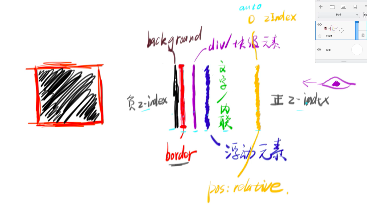
10. 堆叠上下文
- 根元素(HTML)
- z-index值不为auto的 绝对/相对定位的元素就是堆叠上下文
position: fixed也是堆叠上下文opacity: 0.5也是
- 堆叠上下文越后写的级别越高,级别高的堆叠上下文里的所有东西都可以压过级别底的里的所有东西。
- 在父亲是堆叠上下文中的儿子元素即使是
z-index: -1;,在层叠关系里也会在父亲的border和background之上,不会沉下去
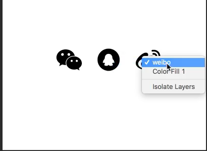
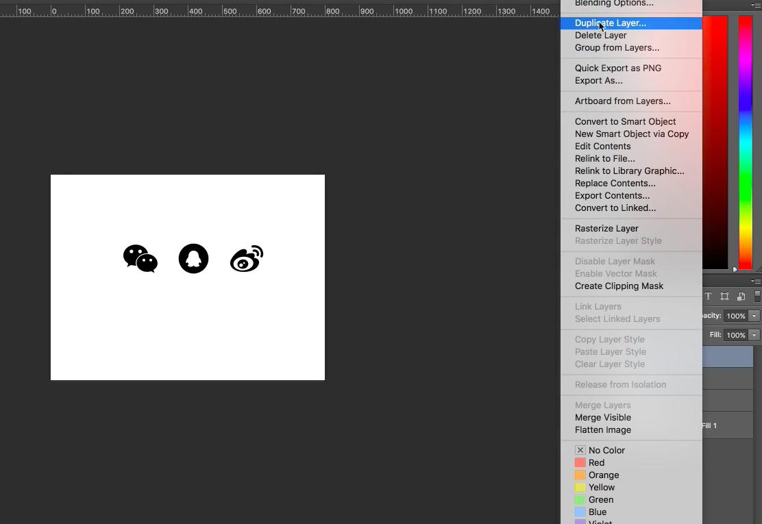
11. icon
ps文件
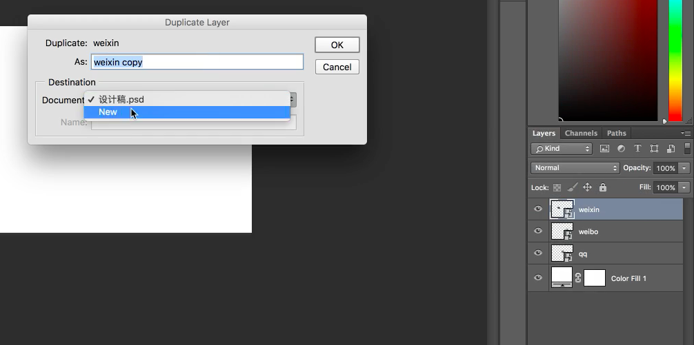
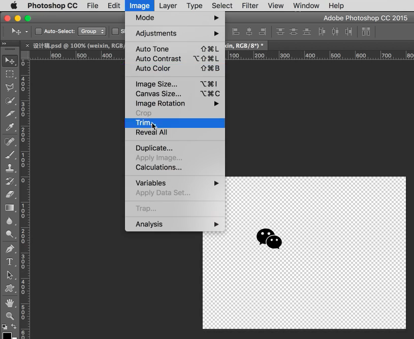
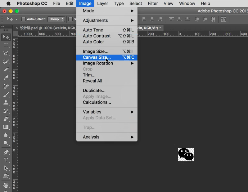
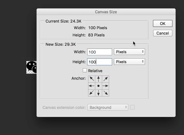 点OK变成100*100,再以png导出,在网页里用img引用即可
png文件
选择魔法棒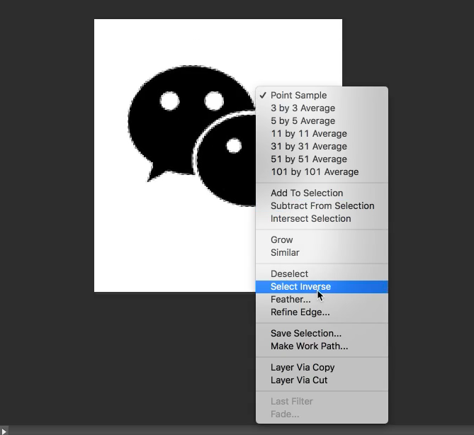
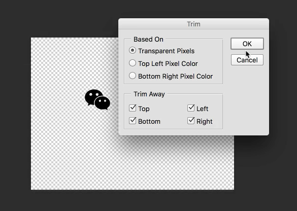
用魔法棒选中自己要的图标,按住shift同时选中这两个,然后反选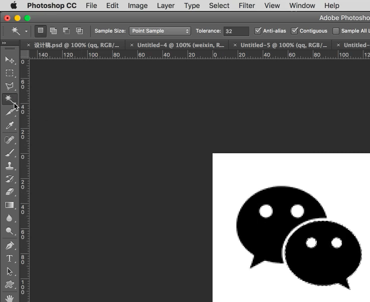 然后按DEL键把背景删除,然后trim裁剪
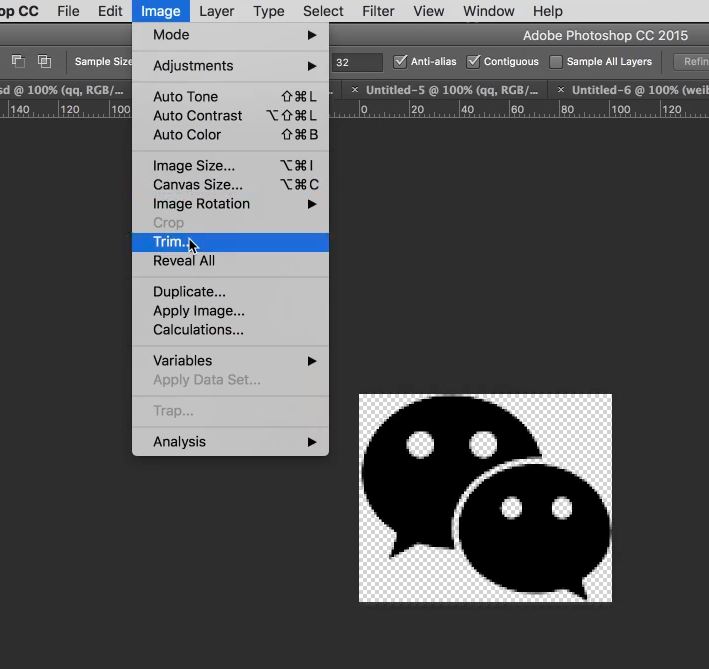
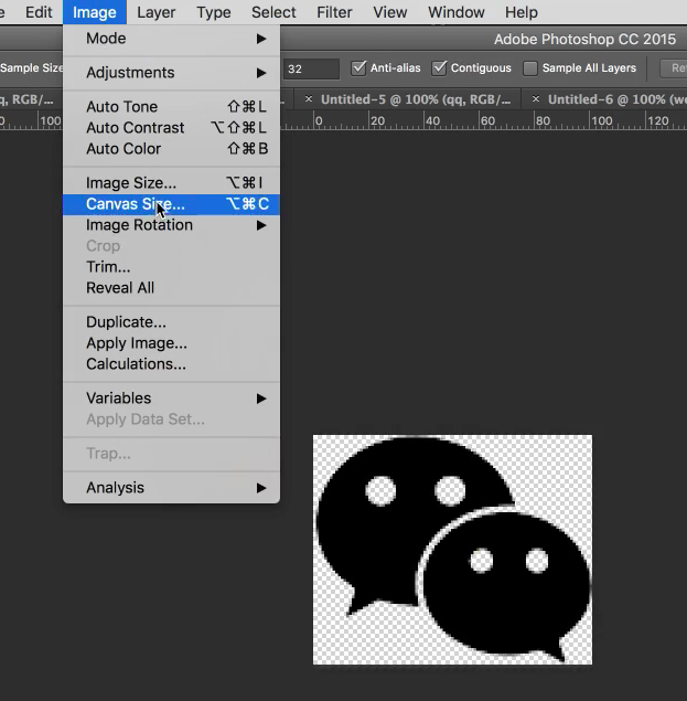 在网页里用img引用即可
用div的background引用图片
1
2
3
4
5
6
7
8<style>
.icon{
display: inline-block;
width: 100px;
height: 100px;
background: transparent url(./qq.png) no-repeat 0 0;
}
</style>css sprites(雪碧图)
- iconfont方法最先进
12. 响应式(基本没人用了)
媒体查询
1
2
3
4
5
6
7
8
9
10
11
12
13
14
15
16<style>
/* 屏幕宽度为300px-325px时的css样式 */
@media(min-width: 300px) and (max-width: 325px){
body{
background: red;
}
}
/* 屏幕宽度小于450px时的css样式 */
@media(max-width: 450px){
body{
background: black;
}
}
/* 这样前面那个就没用了,被覆盖了 */
</style>一般不用第一个方法,直接引用一个手机版的css即可
1
<link rel="stylesheet" media="(max-width:768px)" href="mobile.css">
在屏幕宽度小于768px时,就会渲染这个css,要把这个引用写在main.css之后,把main.css覆盖。
并加上meta:vp1
<meta name="viewport" content="width=device-width, user-scalable=no, initial-scale=1.0, maximum-scale=1.0, minimum-scale=1.0">
13. flex布局

container的属性
1
2
3
4
5
6
7
8
9
10
11
12
13
14
15
16
17
18
19
20
21flex-direction: row;// (默认)所有内容排列在一行
flex-direction: row-reverse; //反向排列在一行
flex-direction: column; //所有内容排列在一列
flex-direction: column-reverse; //反向
flex-wrap: nowrap; //不换行(默认)
flex-wrap: wrap; //自动换行
flex-flow: row nowrap; //上面两个属性的简写
//justify控制主轴
justify-content: space-between; //这两个都是子元素在一行均匀分布
justify-content: space-around;
justify-content: flex-start; //子元素都往起点靠
justify-content: flex-end; //子元素都往终点靠
justify-content: center; //子元素居中
//align控制子元素的侧轴
align-items: stretch; //(默认)把同一行里的子元素的高度都伸展到同一行里最高那个元素
align-items: center; //垂直居中
align-items: flex-start; //往侧轴的起点靠item的属性
1
2
3
4
5
6
7
8
9
10
11
12
13
14
15
16
17
18
19
20
21
22
23
24//flex-grow,当一行空间没占满的时候
.child:nth-child(1){
flex-grow: 2;
}
.child:nth-child(2){
flex-grow: 1;
}
//在同一行内把这两个元素按2比1的比例占满这一行
//这三个元素的简写,后两个很少用
flex: flex-grow flex-shrink flex-basis;
//order(实现双飞翼)
.child:nth-child(1){
order: 2; //改变排列顺序,这个放在第二个
}
.child:nth-child(2){
order: 1; //这个放在第一个
}
//align-self
.child:nth-child(1){
align-self: center; //第一个儿子在垂直方向居中
}
14. 小技巧
对display:none到display:block的过程transition: all 1s;没用,可以改成visibility: hidden;和visibility: visible
15. bootstrap
- 安装
下载css、js文件,js需要用jquery,所以要先引用jquery 栅格系统
1
2
3
4
5
6
7
8
9
10
11
12
13
14
15
16<div class=container> //自动居中
<div class=row> //一行分成12份
<div class=col-md-1>1</div> //这两个分别占1份和11份
<div class=col-md-11>11</div>
</div>
<div class=row> //第二行
<div class="col-md-9 col-md-offset-3">9</div> //这样这个div会往右边对齐,因为第二个class代表往右偏3格
</div>
<div class=row> //第三行
<div class="col-xs-6 col-md-1 col-sm-3">6</div>
//在屏幕宽度很小的时候(手机)占6份
//中等(电脑)的时候占1份
//小(ipad)的时候占3份
//超大屏(col-lg-12)
</div>
</div>秘诀
直接复制官网的html代码,复杂css组件,js组件,定制bootstrap可以自己改样式、颜色小技巧
靠右:不写col-md-...,直接写pull-right主题
下载的文件里有bootstrap.theme.css
16. IFC
font-size是刻字的时候的那个模版的大小line-height是字所占的行高,但不同字体排在一起行高可能会变了,因为每个字体基线位置不同。而在一排要用基线对齐vertical-top是元素实际占的高度的顶部对齐,所以img不写vertical-top的时候是以基线对齐的,下面会空出一点东西- 不要用
inline-block布局了,用flex或float
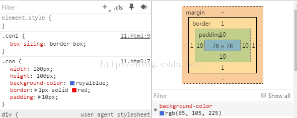 border-box: 实际宽度 == width == 100 == 内容区 + padding + border
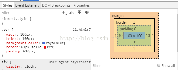 content-box: 实际宽度 == width + padding + border