1. 盒模型
包括:实际内容(content)、填充(padding)、边框(border)
- padding就是内容到border的距离
- margin是border到父元素border的距离
border-box
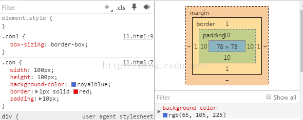 border-box: 实际宽度 == width == 100 == 内容区 + padding + border
content-box
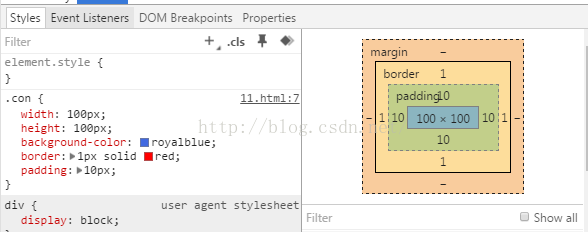 content-box: 实际宽度 == width + padding + border
2. 如何理解HTML语义化
- 举例
比如说,标题就用h1~h6,段落就用p,边栏用aside,主要内容用main - 用处
在没有CSS的情况下,页面也能呈现出很好地内容、代码结构3. meta:viewport
背下来1
<meta name="viewport" content="width=device-width, user-scalable=no, initial-scale=1.0, maximum-scale=1.0, minimum-scale=1.0">
控制页面在移动端不会缩小显示
4. 复习canvas项目
自己再做一遍canvas
5. css Reset和normalize.css区别
- css reset的想法是清除所有默认样式
- 后来normalize.css取代了css reset,normalize自己制定相应的默认样式,用了normalize.css之后,所有浏览器上默认样式都基本一致
6. css居中
1. 垂直居中
若父元素没有写height,则直接在父元素写
1
padding: 10px 0;
子元素就可以居中,所以尽量避免父亲高度确定
让一个元素在父级元素中绝对居中
方法一:
给父级元素加:1
2position:relative; //若父级元素是body可以不用
加再给自己加:
1
2
3
4
5
6
7
8div{
position: absolute;
top: 0;
left: 0;
bottom: 0;
right: 0;
margin: auto;
}方法二:(若不兼容IE,工作中只要用这一种方法即可,最简单,Chrome,移动端都可以用)
给父元素加:1
2
3display: flex; //让它变成一个弹性盒
justify-content: center; //水平居中
align-items: center; //垂直居中table自带居中(兼容IE)
1
2
3
4
5
6
7
8
9
10
11
12
13
14
15
16
17
18
19
20<html>
<style>
.parent{
border: 1px solid red;
height: 600px;
}
.child{
border: 1px solid green;
}
</style>
<body>
<table class="parent">
<tr>
<td class="child">
文字
</td>
</tr>
</table>
</body>
</html>文字会居中
用div假扮table(兼容IE)
1
2
3
4
5
6
7
8
9
10
11
12
13
14
15
16
17
18
19
20
21
22
23
24
25
26
27
28
29
30<html>
<style>
div.table{
display: table;
border: 1px solid red;
height: 600px;
}
div.tr{
display: table-row;
border: 1px solid green;
}
div.td{
display: table-cell;
border: 1px solid blue;
vertical-align: middle;
}
</style>
<body>
<div class="table">
<div class="tr">
<div class="td">
文字
</div>
</div>
</div>
</body>
</html>用100%高度的before和after
1
2
3
4
5
6
7
8
9
10
11
12
13
14
15
16
17
18
19
20
21
22
23
24
25.parent{
border: 3px solid red;
height: 600px;
text-align: center;
}
.child{
border: 3px solid black;
display: inline-block;
width: 300px;
vertical-align: middle;
}
.parent:before{
content:'';
display: inline-block;
height: 100%;
vertical-align: middle;
}
.parent:after{
content:'';
display: inline-block;
height: 100%;
vertical-align: middle;
}绝对定位加上margin-top: -自身height的50%
1
2
3
4
5
6
7
8
9
10
11
12
13
14
15
16
17
18
19
20
21
22
23
24
25
26
27<html>
<style>
.parent{
height: 600px;
border: 1px solid red;
position: relative;
}
.child{
border: 1px solid green;
width: 300px;
position: absolute;
top: 50%;
left: 50%;
margin-left: -150px;
height: 20px;
margin-top: -10px;
text-align: center;
}
</style>
<body>
<div class="parent">
<div class="child">
文字
</div>
</div>
</body>
</html>让一个背景图居中,并且让它自适应屏幕
1
2
background: url("wallhaven-w-min.jpg") no-repeat center center ;
background-size: cover;
2. 水平居中
块级元素水平居中
1
2
margin-left:auto;
margin-right:auto;内联元素水平居中,给它们的父元素加上
1
text-align:center;
若不是内联元素想让它居中,可加display:inline-block,加了之后一般还要加下面这句,不然可能会有bug(下面可能会空出一行)
1
vertical-align: top;
让导航栏横过来,并在同一行里均匀分布
给ul加css1
2
3
4ul{
display:flex;
justyfy-content:space-between;
}去掉li的
float:left
去掉ul的clearfix
7. 选择器的优先级
- id比class优先级高
- 同样优先级,写在后面的会覆盖前面
- a:hover和a的优先级一样,所以加hover样式的时候,hover要写在下面。不然会被覆盖
- color: red !important 优先级最高
8. BFC
块格式化上下文(Block Formatting Context),面试的时候举例说明
1. 功能一(bfc用来包住儿子元素)
- 父亲若是以下七种情况,则是bfc(可以包住它的儿子)
- 浮动元素(float:left或right)
- 绝对定位
- 内联块(display: inline-block)
- 表格(display: table-cell 或 display: table-caption 或 )
- overflow的值不是visible(如overflow:hidden)
- display: flow-root(css新规则,专为bfc而生)
举例11
2
3
4
5
6
7
8
9
10
11
12
13
14
15
16
17<style>
.father{
width: 100px;
height: 600px;
border: 4px solid red;
overflow: hidden
}
.son{
border: 4px solid green;
float: left;
}
</style>
<body>
<div class="father">
<div class="son">2</div>
</div>
</body>
答1:bfc的overflow: hidden可清除浮动(但平常清除浮动用clearfix即可)
答2:父亲的overflow: hidden取消父亲儿子的margin-top合并,若父亲没加overflow:hidden,儿子的margin-top同时也会给父亲(平常若不想用bfc,给父亲加一个padding-top: 0.1px,也可以达到这个效果)
- 父亲里的儿子没有float的话,儿子之间的上下margin会合并
- 父亲会包住儿子,但如果儿子里面有孙子且儿子是bfc的话,父亲是不会管孙子的
2. 功能二(让浮动的兄弟之间划清界限)
float+div做左右自适应布局,如果不加bfc,兄弟会重合(因为有float)
举例21
2
3
4
5
6
7
8
9
10
11
12
13
14
15
16
17
18<style>
.brother1{
width: 100px;
height: 600px;
border: 4px solid red;
float: left;
margin-right: 20px;
}
.brother2{
height: 600px;
border: 4px solid green;
display: flow-root
}
</style>
<body>
<div class="brother1">1</div>
<div class="brother2">2</div>
</body>
这个功能可以用flex布局实现,bfc被淘汰了!1
2
3
4
5
6
7
8
9
10
11
12
13
14
15
16
17
18
19
20<style>
.brother1{
width: 100px;
height: 600px;
border: 4px solid red;
margin-right: 20px;
}
.brother2{
height: 600px;
border: 4px solid green;
flex: 1;
}
body{
display: flex;
}
</style>
<body>
<div class="brother1">1</div>
<div class="brother2">2</div>
</body>
9. 如何清除浮动
- bfc的overflow: hidden
1
2
3
4
5
6
7
8
9
10.clearfix::after{
content: '';
clear: both;
display: block;
}
//若要兼容IE
.clearfix{
zoom: 1;
}
10. 父亲儿子margin合并
1 | <head> |
这样儿子的margin-top也会给到父亲,把父亲挤下来,但只要在父亲里加:
border-top: 0.1px solid green;display: table;display: flex;(不加width的话会把width变成0)display: inline-block(不加width的话会把width变成0)